Anton Andryukov,Brand Designer and Art Director
Selected Work
MosTransProject, Moscow, Russia · 2025 — present
Editorial Design · Design Direction
I currently serve as Head of the Design Team at MosTransProject, a project of the Moscow Government.I am responsible for shaping the visual strategy and developing the design direction within the scope of state and international communications.
My responsibilities include:
- developing product concepts within the company;
- participating in the creation of all visual materials (from presentations to international publications);
- working with communication design.
The main goal of our team is to create a cohesive visual language for projects. We pay special attention to the balance between visual expressiveness and functionality:
the design must capture attention while effectively conveying complex information.
TROIKA
For Moscow Transport Week, I developed the
concept and design of a limited‑edition
Troika card, combining functionality
and emotional impact in a single object.
The key feature of the card is an integrated light element: when the payment is processed, a soft light illuminates inside the graphic heart symbol.This detail transforms an everyday action into a small interactive moment, creating a sense of feedback and a «living» interaction with the city.
The visual solution is based on the idea of connectivity — uniting all types of transport services into a single graphic system.
This is a project at the intersection of industrial design and user experience, where a technological detail becomes a part of the visual language and enhances the emotional perception of the product.


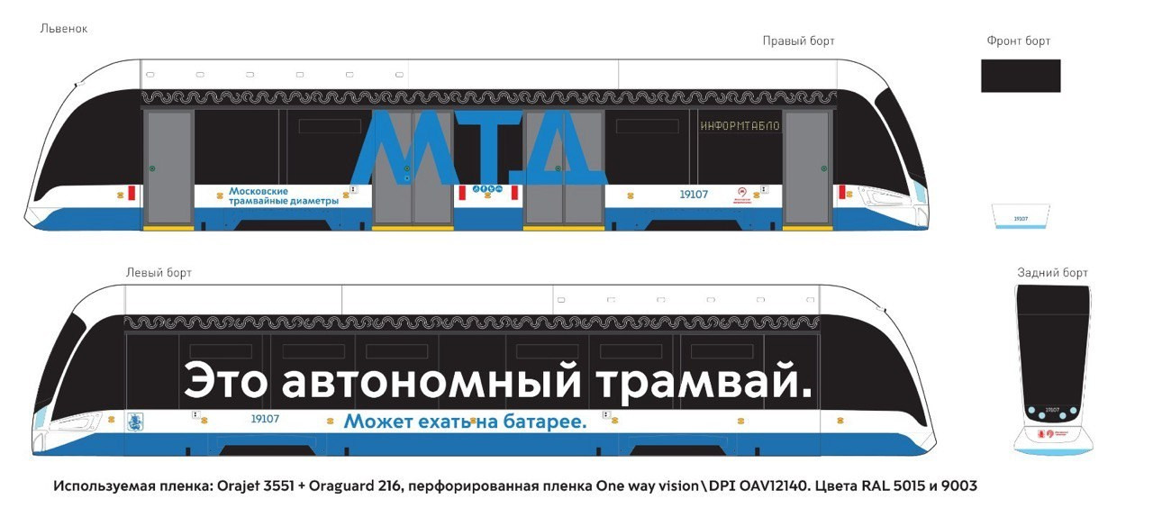
MTD
Transport Branding and Information Design
A visual design scheme was developed for Mosgortrans. The large‑format sticker «Autonomous Tram» serves both an image‑building and an educational purpose: it instantly communicates the innovative status of the transport mode, increases the visibility of the technology in the urban environment, and builds passenger trust in new mobility formats.


Personalised Exclusive Gifts
At the project outset, I developed a creative concept and then created 3D models of characters using AI tools. Each character’s design was carefully tailored to reflect the professional roles and personal interests of the recipients.
In collaboration with 3D designers, I helped to design all composition elements. These were subsequently 3D‑printed and hand‑painted. Additionally, a special packaging design with transparent elements was developed for the project.
This packaging allows the contents to bevisible at first glance and enhances the overall presentation effect.


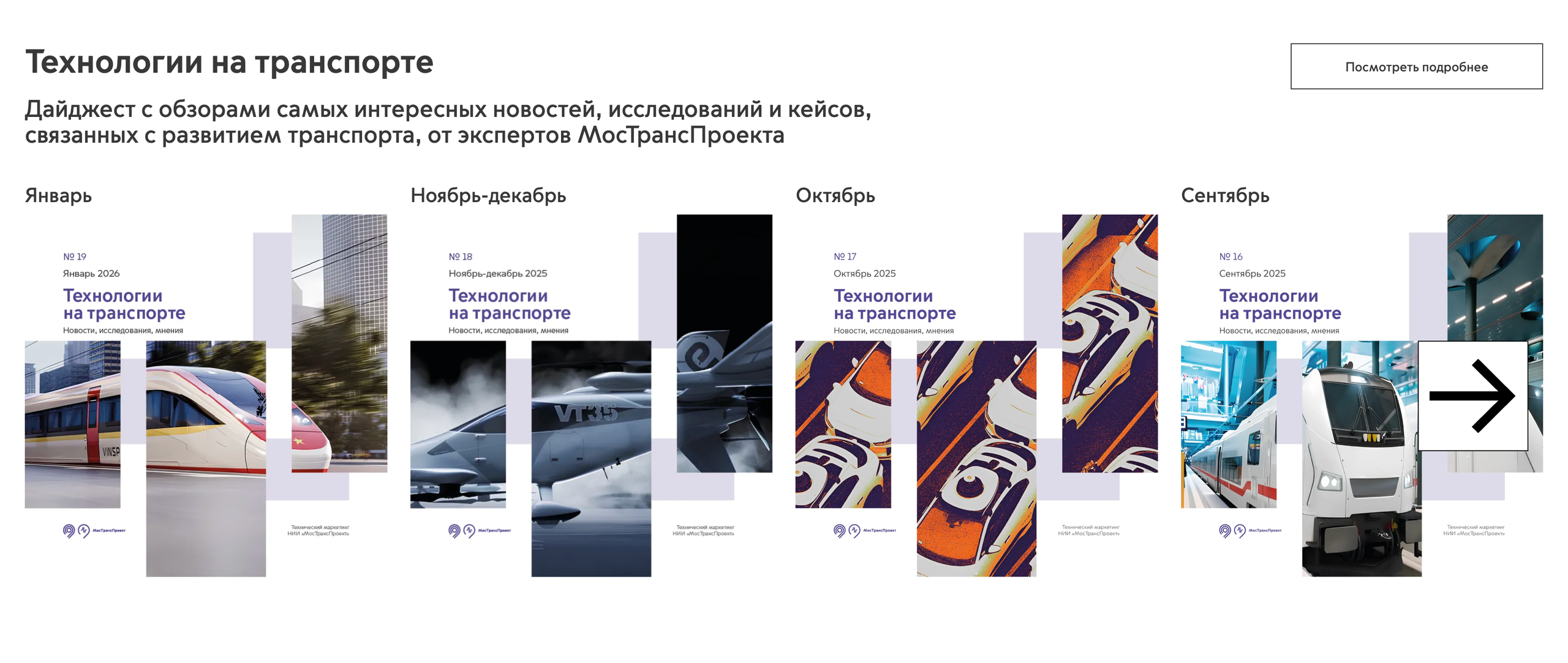
TECHNOLOGIES IN TRANSPORT
Project role: Concept and structure development for publications (pre‑layout stage).
Key focus:
- establishing a unified visual style;
- ensuring clear and comfortable information perception for readers.
TT group Belgrade, Serbia · 2022-2024, Corporate identity · Art direction ·
I was working on creating a visual language for a corporate group that combined several different formats: a modern bistro, an Asian cuisine restaurant, a premium hotel restaurant, and a barbershop. The goal was to create a concept that combined minimalism, modernity, and a structural approach with the local spirit and uniqueness of each space.The main task was to create a visual system that would emphasize the character of each format, but combine them into a single ecosystem. This approach has increased brand awareness, made it cleaner, simpler and closer to a modern audience. During the 2 years of my work, the network expanded and grew, opening new outlets and gradually forming a community of people who choose aesthetics as a way of life.
This project is an example of how minimalistic design and thoughtful artistic direction can transform a collection of various establishments into a solid, stylish and vibrant brand.


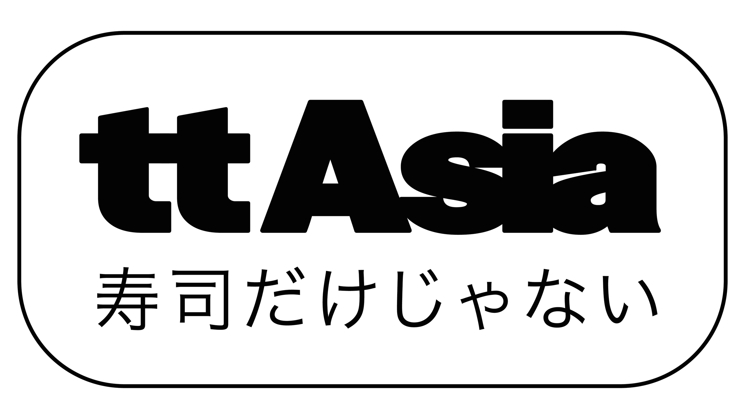
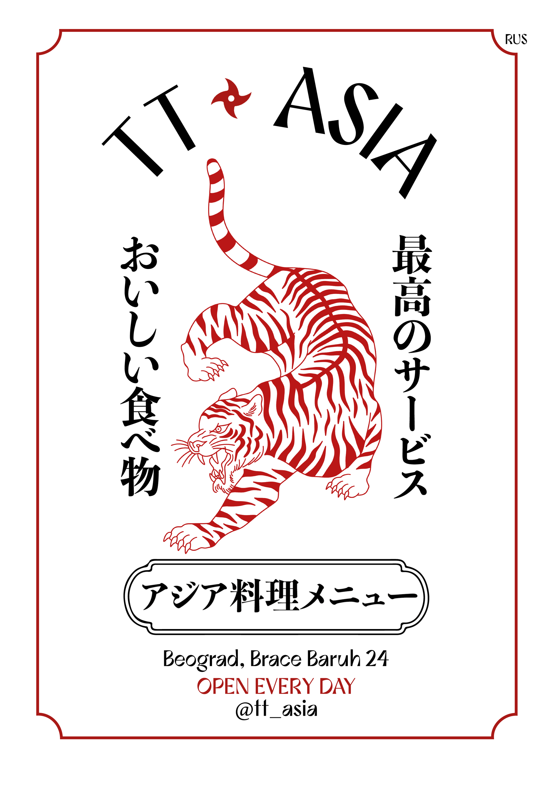
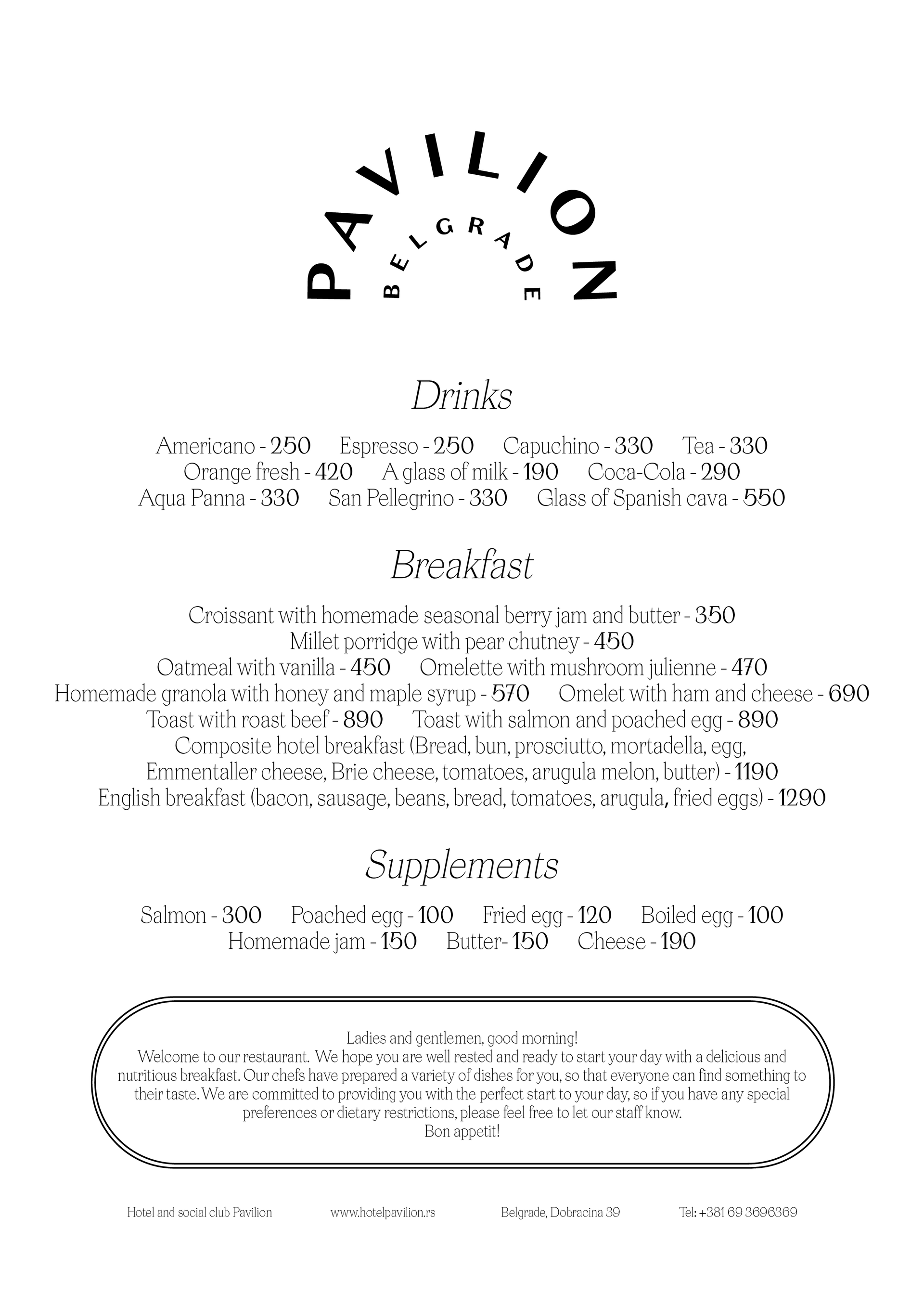
TT Asia Belgrade, Serbia · 2023 · Brand Design · Menu Design · Art Direction
TT Asia is an Asian fusion restaurant with premium presentation and street character. For the brand, I created the entire visual identity system, where oriental motifs are intertwined with modern minimalist aesthetics. Hand-drawn graphics, accent elements, clear structure and street flow. Here, every element — from fonts and corporate colors to prints, packaging, and menus — works as part of a single story.


TT Cuts Belgrade, Serbia · 2024 · Brand Design
In this project, I created a style for a niche barbershop in Belgrade with an unobtrusive European vibe. The logo and merch for the staff were an outlet for creativity, with its own character, where each element reflects the spirit of the place. The project is especially valuable because it gave freedom and allowed us to play with visual solutions, making the brand vivid and memorable.


Outdoor Design Adidas Mena | Dubai UAE
Layout and adaptation of outdoor advertising by Adidas. Large formats, maximum readability from a distance. Working with billboards, facades, and storefronts. Control of typography, rhythm and hierarchy in strict accordance with the Adidas brand code.


22 Agency · 2025 · Brand Design · Moscow
In this case, I created a unique style for a video production agency, inspired by the aesthetics of French brands. A complete package was completed: the selection of fonts, color palettes, several logo options, the creation of business cards and layouts for the design of social networks. It was important for the customer to keep the brand name 22 at the heart of the logo, while making it elegant, modern and easily recognizable.


22 Agency Global · 2025
The alternative version has also been developed for the international market. The logo has received several variations: flexible, elegant, easily adaptable to different formats — from titles and promo videos to the web interface and graphic arts. I have developed a second version of the identity, which is more versatile, scalable, and focused on the global visual context. A balanced palette and an emphasis on visual rhythm create an aesthetic that looks equally organic in Paris, and in New York, and Dubai. The identity turned out to be stylish, confident and global — ideal for the agency's international clients.


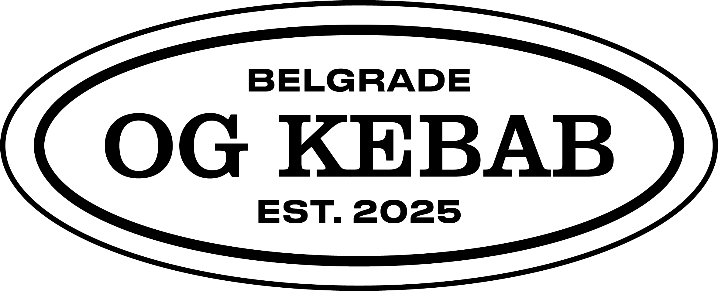
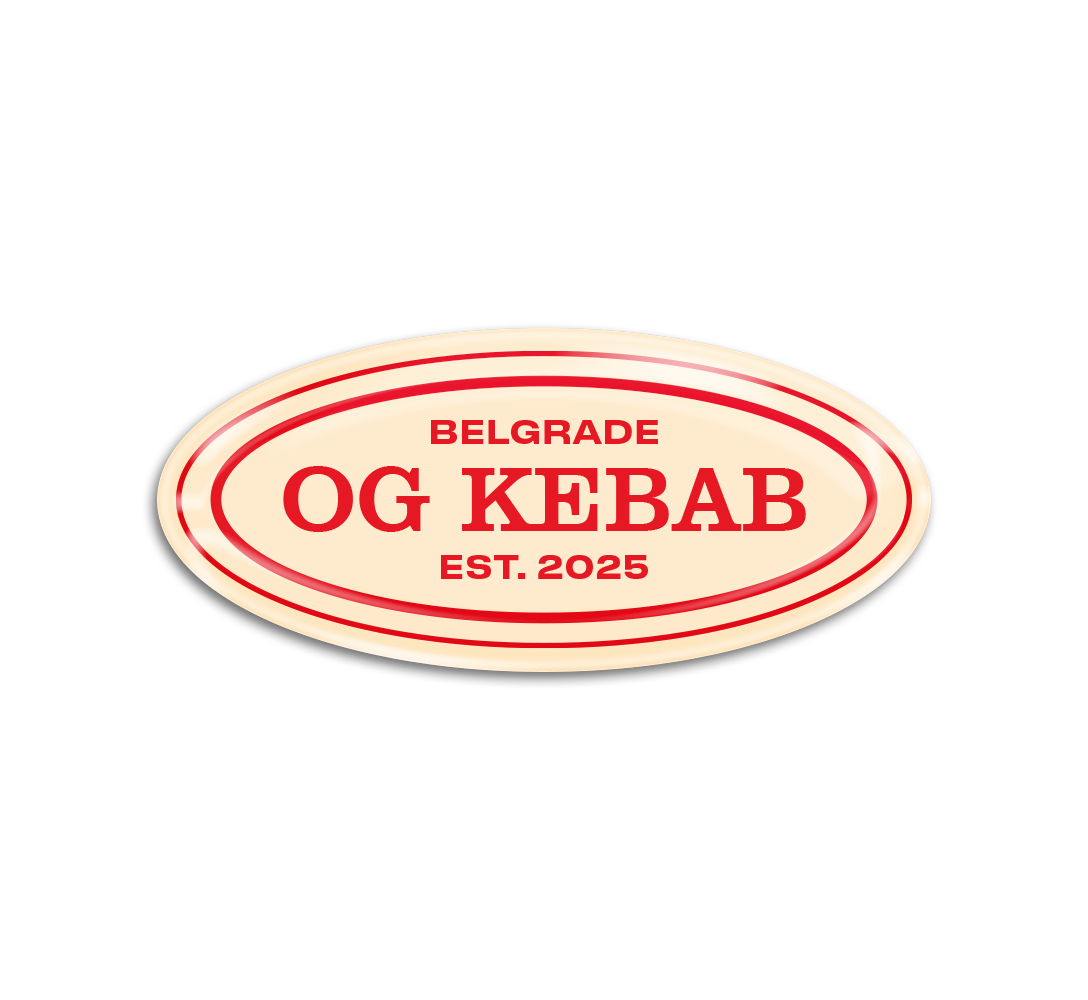
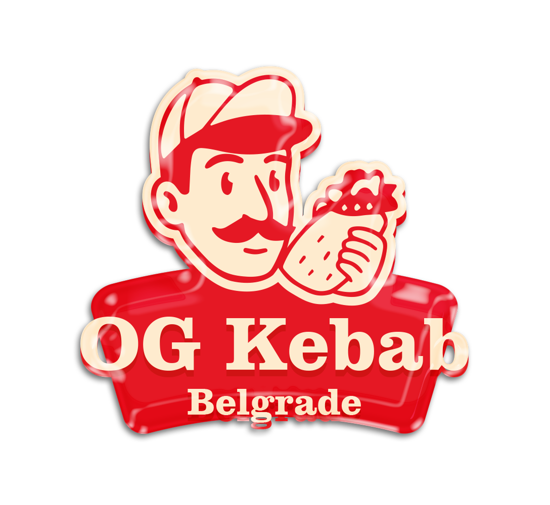
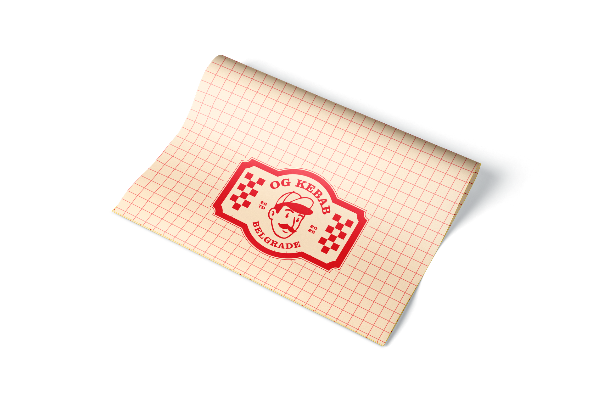
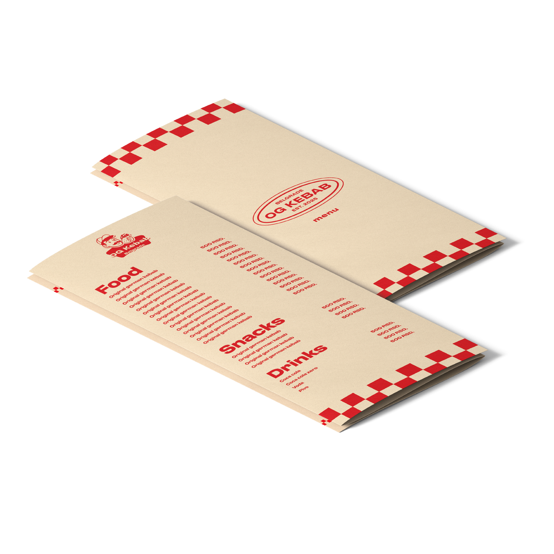
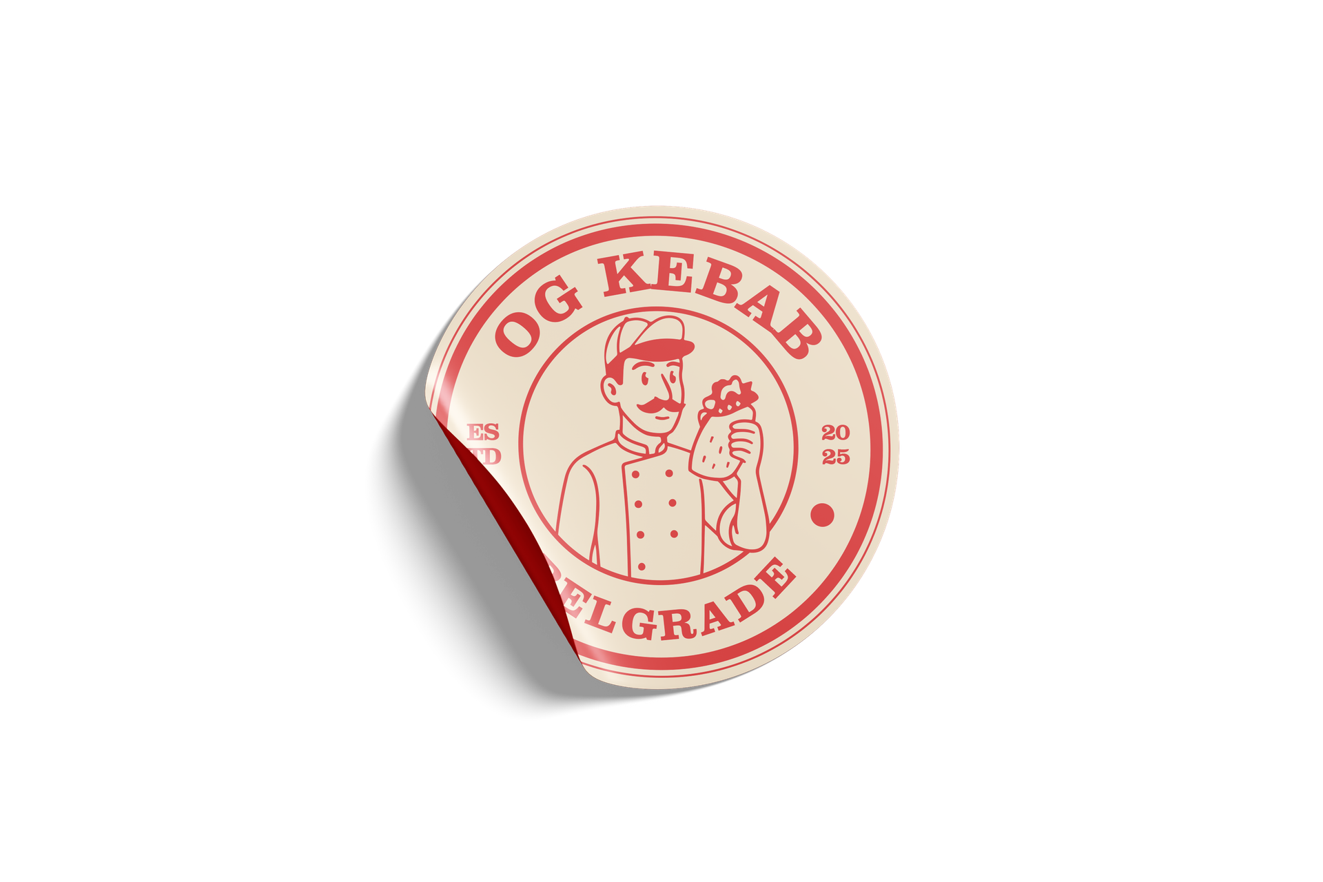
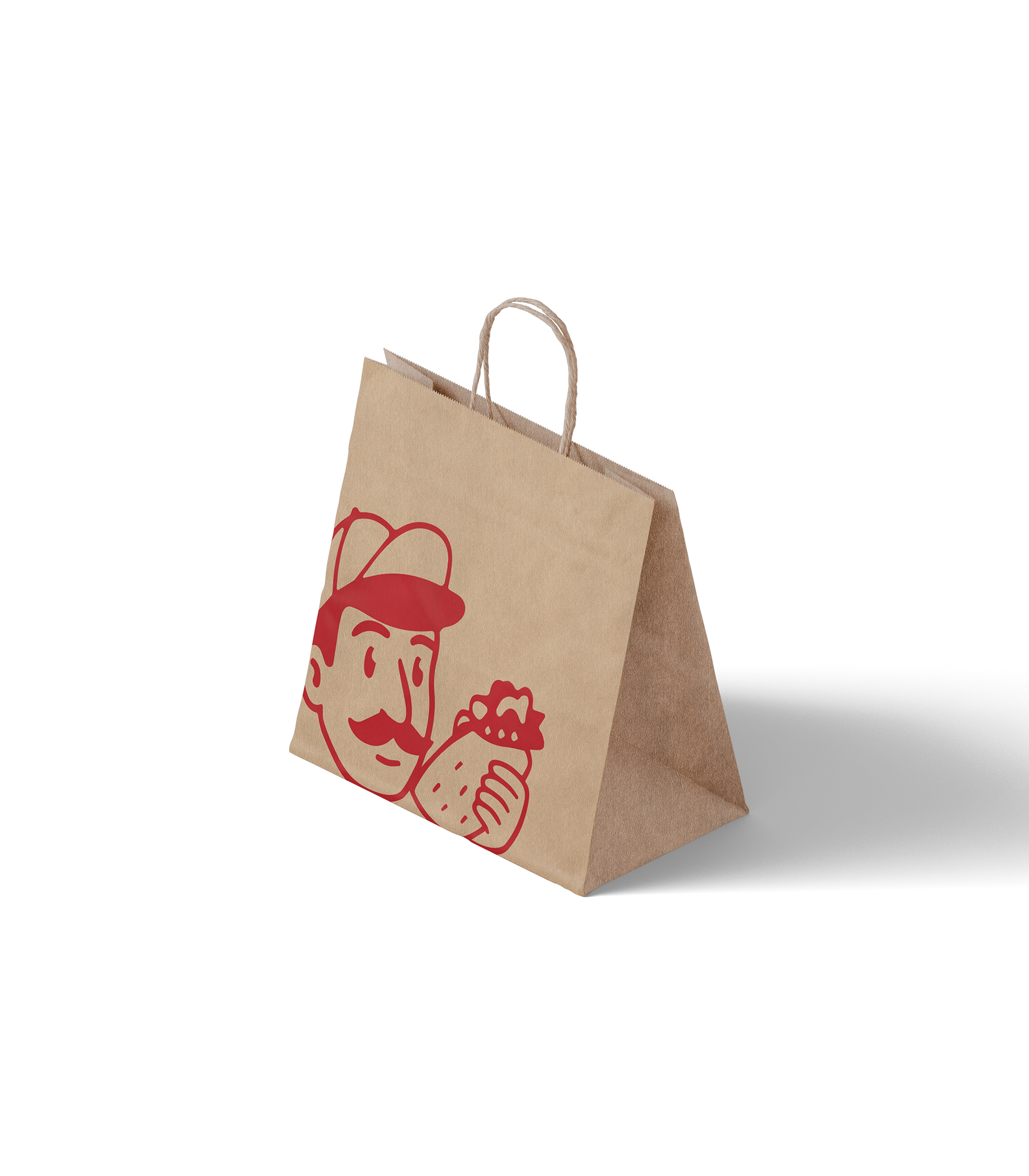
OG KEBAB Belgrade, Serbia · 2025. Brand Design · Art Direction
In this project, I created an identity remotely and from scratch for a trendy kebab shop in Belgrade, inspired by the Berlin spirit. My tasks included the complete packaging of the brand: branded fonts and colors, handmade logo, shipping packaging, signage. I have designed a complete guide book for the client so that the whole style works 100% — from social media to storefronts and merch.


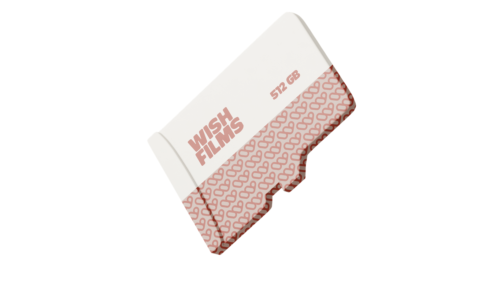
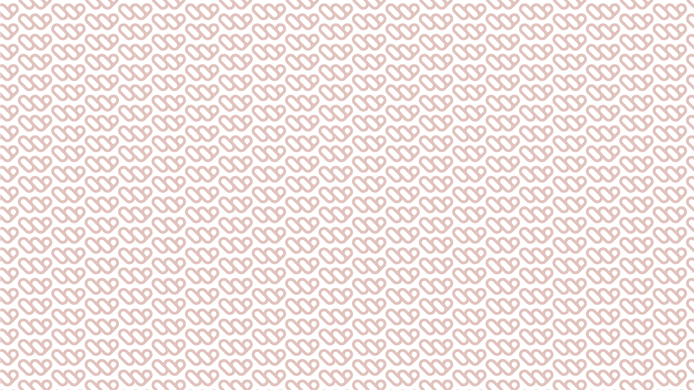
WISH FILMS · re-Branding · 2025 · Moscow
The project for photo and video production. The client's task is to create a logo. The purpose was to get into an identity that was minimalistic and daring, but with a slight romantic note. In the logo, I combined two symbols that move the brand: a film reel and a heart. Together they form the recognizable capital letter of the brand — W.


100 HP 2025. Art Direction · Visual Design100 HP
is a digital project of the B2B segment in the field of mobile games. In it, I mostly acted as an art director, created visual materials for social networks, booths for offline exhibitions in different countries, and formed the overall visual language of the project.The project combined pixel style, minimalism, a bright palette and retro gaming, which made it possible to distinguish the brand from competitors. The work covered both digital and offline environments, combining social media and exhibition materials into a single visual ecosystem. The project is international and was implemented in 2025.


MERCH
Many years I am in design for merch and packaging for major brands and local projects, from T—shirts and hoppers to branded accessories (TT Group, Wild Travel, Pari Vision, Valley Rouge, OG Kebab, etc.).
Minimalism is often associated with experimentation in my work, and each work is a small visual charge for the brand. There are dozens of projects all over the world, and each one leaves its own stylish mark.


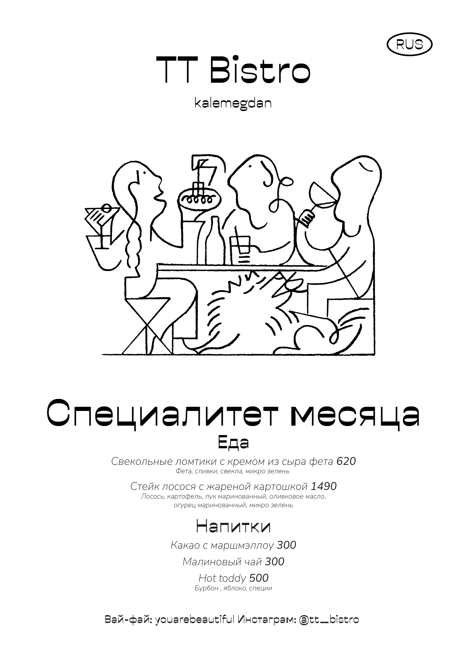
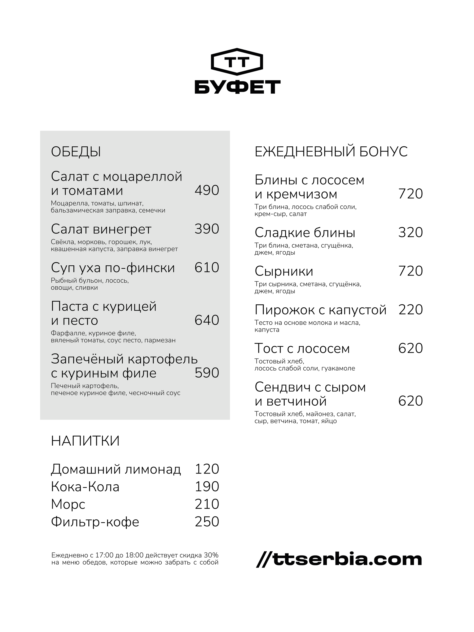
MENUES
TT MenuBelgrade, Serbia · 2025 — Graphic Design · Art Direction
For TT company, I created a menu that was a natural extension of their atmosphere — stylish, European and slightly daring. Minimalistic approach: clean lines, hand-drawn graphics and modern visual plastics that emphasize premium quality without unnecessary noise. This is the case when the visual does not just list the dishes, but conveys the mood of the place.
POSTERS